
Looking for responsive web design services? You are in the right place.
Today, there are almost no modern websites that are not responsive in design. What does that mean? Responsive web design (RWD) refers to adapting a web page to a device or screen size.
In other words, besides being “normally” displayed on desktops and laptops of different sizes, such pages are also adapted to smartphones and tablets from which the user accesses them so that the information on the screen is clear and legible.
According to Statista, there are nearly 7 billion mobile users worldwide. Over 54% of internet activities are performed on mobile devices, followed by computers with over 42%, and tablets (2,52%). Given the number of users who surf the Internet, offering the most efficient user experience is essential.
People don’t need to sit down at desktop or laptop computers to shop. They can find anything they want on their smartphones.
Nowadays, most new websites are responsive, and if yours isn’t responsive yet, you’ll probably want to upgrade or change it completely.
If you’re new to web design, you might wonder why responsive design matters. In this article, we bring you the meaning, advantages, and importance of responsive website design.
What is a responsive website design?
Responsive web design is all about creating web pages that look good on any device. Responsive websites can be viewed on any device, from large HD monitors to small phone screens. Page widths, colors, texts, links, graphics, and videos adjust automatically to fit the size and shape of any screen.
With responsive web design services, you can ensure that your website features the content and tools you need to grow your business.
When you are thinking about making your design more responsive, you have to consider three main things. The first one is changing the layout.
For example, if you created four columns of content, your screen will be way tighter, so you’ll have to restructure your layout.
The second thing is to adjust the sizes. For instance, the mobile phone screen is smaller, so you need to make your text smaller and adjust everything.
Last, you have to consider whether you want to keep all your content, remove it, or condense and hide it under some navigation. People today have less time and less attention to looking at all the details, especially if they aren’t relevant.
Responsive web design will do the work just by adjusting to the user’s device. Still, following some best practices is the way to go and make your site more successful. These practices include:
- Testing website prototypes on every device
- Making scannable content
- Choosing intuitive navigation menus
- Adding call-to-action buttons
- Using an internal search feature to keep users on your website
Advantages of responsive design
Responsive web design is an investment to build your brand awareness, diversify your user experience (UX) and attract more visitors. Responsive web design services ensure a web solution’s adaptive behavior to the screen size. The main advantages of responsive design are:
- Increased website visibility in Google search
- Better SEO
- Increased traffic
- Optimal user experience
- Increased number of users
- Increased brand visibility
- Competitive advantage
- Sales growth
Examples of responsive web design services
Dropbox
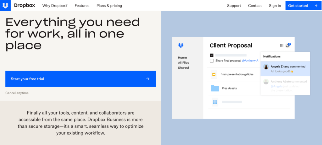
Dropbox did a great job using a fluid grid and clean visuals to design a responsive, user-friendly website. Their website offers a tailored experience for each device.
For example, there is a call-to-action button under the headline to prevent users from bouncing, offering users a free trial. Users can easily navigate through the website and easily access the content with relevant information and Single User Plans to check the best option.
Dribbble
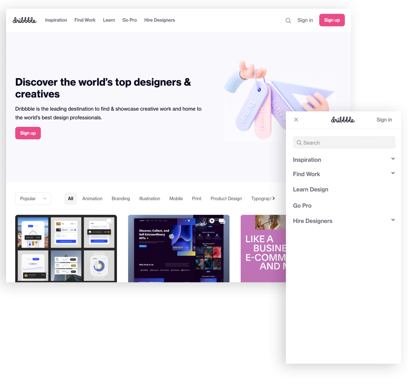
The Dribbble homepage has a flexible grid that converts to a smaller number of columns for smaller screens. For example, it has five columns for a desktop, while it has two columns for a mobile and a tablet.
Dribbble is an excellent example of responsive web design as they have removed a few items for the mobile screen to make the mobile display clear and tidy.
For instance, there is open navigation (menu) and the search bar on the desktop display, while on the mobile, there is a so-called “hamburger” menu (three bars), where the search bar is located.
YouTube
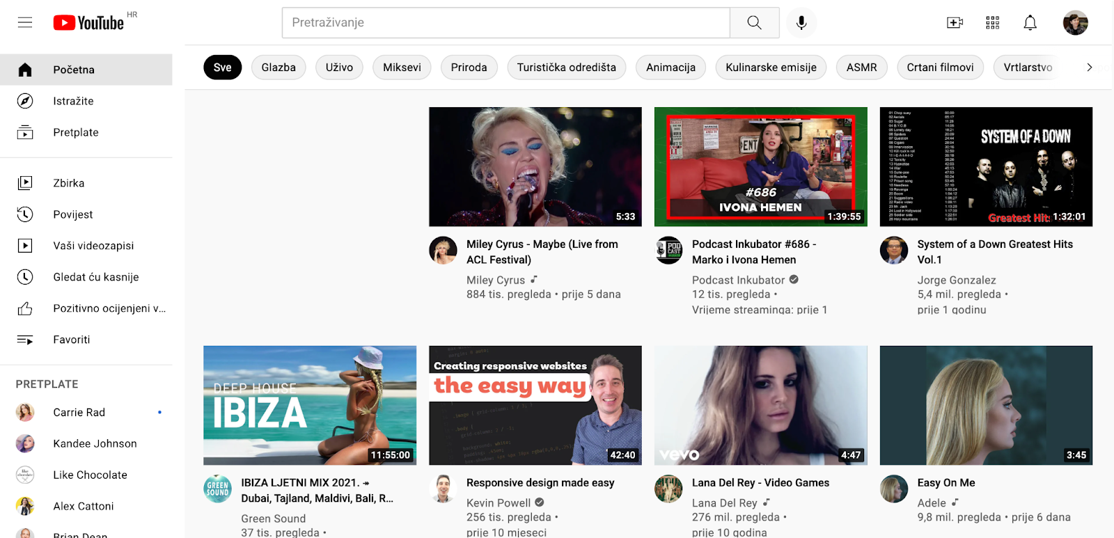
YouTube’s homepage design focuses on a flexible grid of videos relevant to each user, going from a horizontal reading on the desktop to a vertical reading on mobile. The number of columns in each row is three on tablets and one column design on mobile phones.
YouTube uses simple moves to improve navigation and user experience. For example, the mobile version has the main menu at the bottom of the screen, which is closer to the thumbs of phone users.
Async Labs
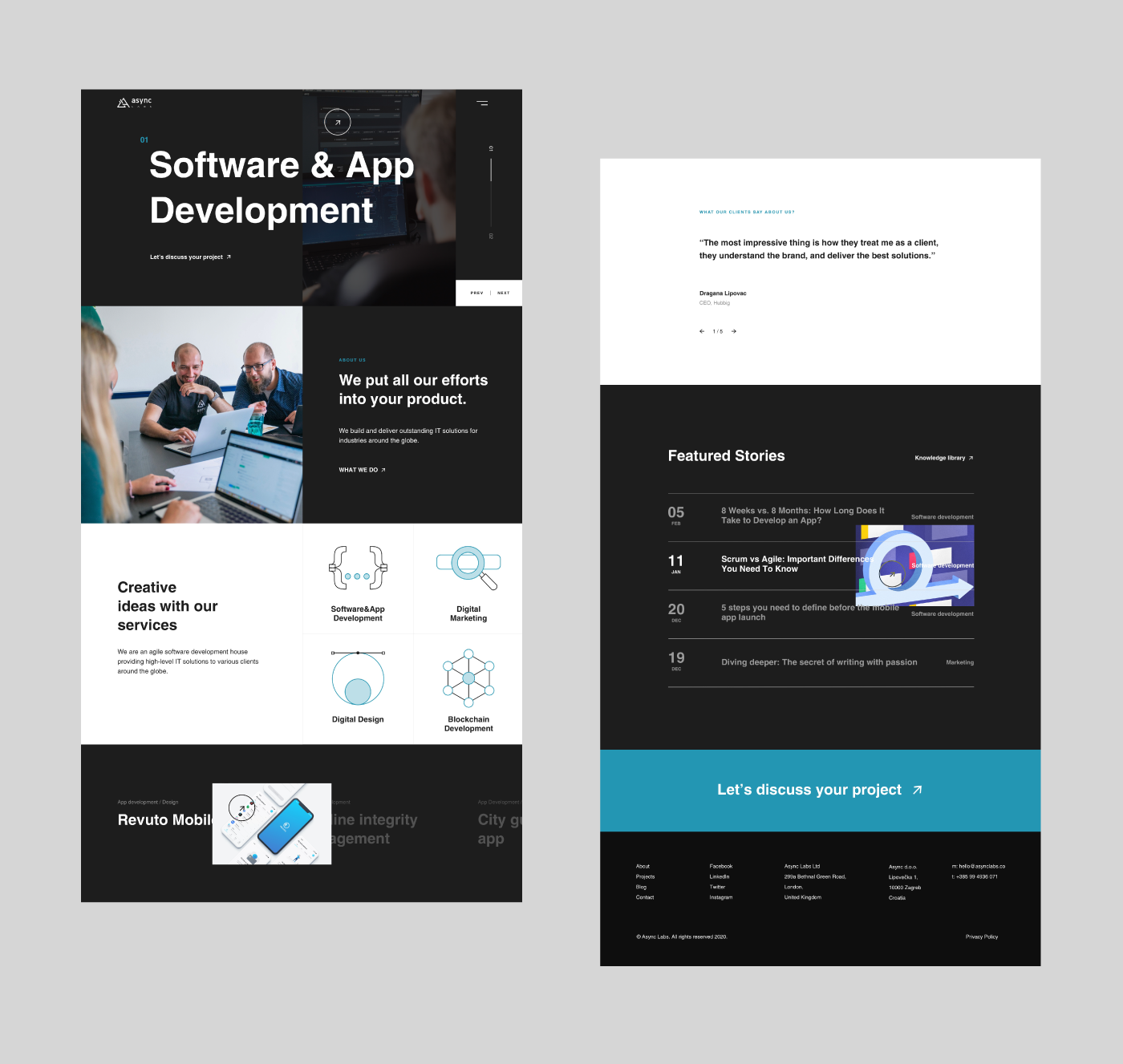
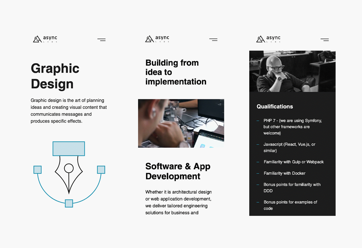
A big plus with our website is that it is made in a fluid grid, which means that columns are defined in CSS that automatically adjust to different screen sizes.
We also have flexible visuals so, along with the typography, we have a design that can be adapted to any device, regardless of the size and shape of the screen.
Why is a responsive web design essential for your business?
Responsive web design is essential for easily accessible information and a positive user experience independent of the device used to browse the web. No matter which device your visitor uses, you always want to give them the best possible experience.
Users usually don’t have time to scroll left and right and zoom in on your website. If your page isn’t optimized for display on mobile devices, users will probably go to your competitor’s website in a second.
Responsive web design gives users a better impression of your business, thus increasing the possibility of selling your products or services. It is an essential item to consider when planning to create a website or webshop.
Even if you already have a website not adapted for mobile devices, responsive web design services and a team of experts can solve this problem quickly.
With the newest and unique coding technology HTML and CSS codes, your website will automatically recognize the viewer’s device, resize, shrink, or enlarge the pages, and look good on all devices.
We at Async Labs develop user-friendly, responsive sites that work on all operating systems. Our page development techniques are focused and customized on your services and specifically designed to help you generate more leads.
Allow your users to interact with you and enjoy your content instead of just looking at it!
Why do you need responsive web design services?
Improve your position in Google search results
Responsive web design makes it easy for Google to index your website to show it up near the top. After redesigning or creating a new website, you will see that your position on Google has improved significantly.
Responsive design is one of the primary factors of SEO optimization. When you use your smartphone when accessing a website, a unique tag appears on the search engine, telling users that the website is mobile-friendly.
Expand your target audience and reach more customers
It is essential to give users a good experience when visiting the website on the device of their choice.
Improve user experience
The responsive design provides an optimal user experience no matter the platform.
Statistics show that most visitors to your website have a better opinion of your business if the site is personalized for mobile devices.
A higher ranking brings more traffic
There is no successful website without a high ranking from search engines. Almost 29% of people click on the top result when they search for something on Google. About 16% of searchers click the second result, and only 11% will click the third result. The truth is that people don’t bother themselves visiting the second page.
If your website doesn’t make it to the first, you won’t get much organic traffic. The more attention you get from search engine crawlers, the more organic traffic you can expect. And responsive web design plays a key role here.
Keep visitors engaged in lowering your bounce rate
A standard, desktop-centric website design will work on mobile phones, but the content will load slowly, and it will be difficult for users to find what they want. Users often get annoyed after only a three-second load.
Looking for instant information is becoming an essential thing with how younger generations interact with devices. Conforming to their preferences now broadens your brand’s appeal and keeps you on the cutting edge of technology.
Make responsive web design easy with the best responsive web design services
The conclusion is that responsiveness nowadays is no longer just a need but also a standard. Responsive design is fundamental to capture the users’ attention and give them a great experience.
You don’t want to lose users because your site isn’t visible on their mobile phones and other devices that access your site.
If you have a website or webshop, check if the website is customizable for display on all devices. If your answer is yes, your website is responsive for all displays. But if your answer is no, then your website is not responsive, and it’s time to take action. Contact us to get started with your new responsive website today!