Branding for DressApp
.GREEN
We created a brand and art direction for a fashion platform that presents a thoughtful way of living and buying to slow down excessive production and mindless consumption.
Service
:Branding
Visual Identity
Graphic Design
Client
:SunApp Factory d.o.o
Date
:October 2022 – November 2022
About
DressApp.Green is envisioned as a platform for users who believe slow fashion trade is essential to making our planet more sustainable. The whole brand promotes and presents all those small, independent and environmentally conscious designers and producers of the fashion industry who, through their work, advocate for slow fashion principles.
Challenge
We researched, asked questions, and learned the necessary information about the topic and brand. The collected information about the client’s preferences, the company’s mission, the organization and why it exists, vision, advantages and disadvantages, competition, brand message, and characteristics showed us the direction we should develop the brand.
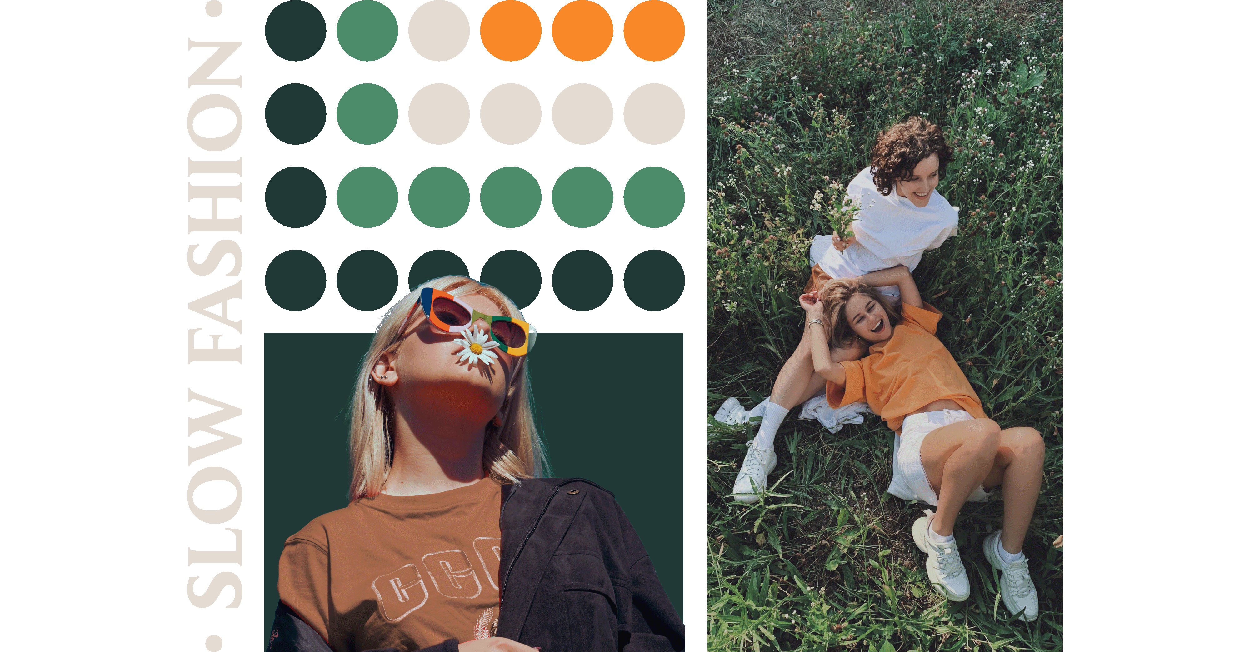
Research and Mood Board
We conducted a discovery phase with the client to better understand the business idea, target audience, competition, and prevailing trends in the industry. Based on the results from the first phase, we created a mood board, which laid the foundations for further design.
The brand's core message is to promote and popularize slow and sustainable fashion, as it is crucial for individuals of this generation to actively participate in shaping a better world by consciously choosing brands that make a positive impact.
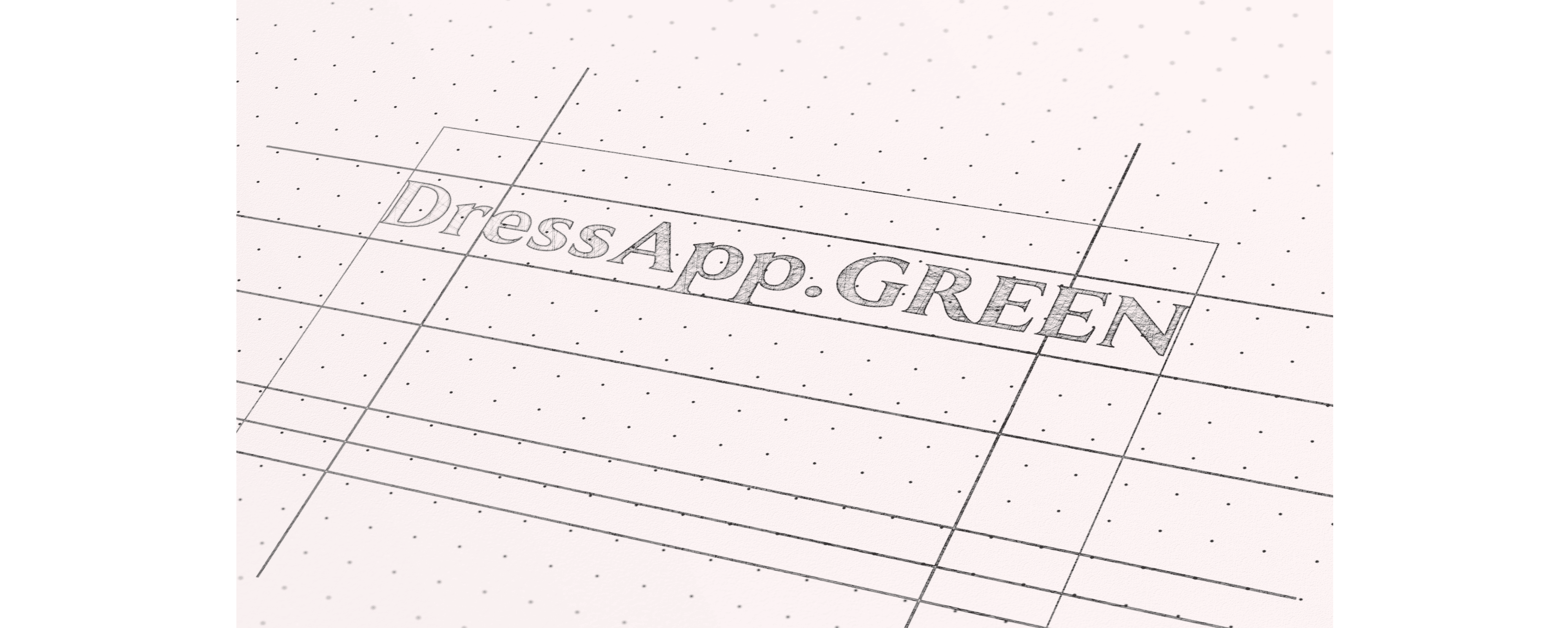
Logo sketching
When creating the logo, the priority was effectively conveying the brand's message. To accomplish this in collaboration with the client, we selected a few motifs, such as a button representing the fashion industry, the planet Earth and the sun as a representation of sustainability.
Concept & Finalising logo
The concept presents the client with a visual representation of how the logo appears within the chosen color palette, accompanied by options for typography, layout, and graphic elements.
During this phase, the logo is modified, standardized, and adequately constructed. The initial letter "G" (GREEN), derived from the company name, in an abstract manner to symbolize the planet Earth and the sun. The sun motif has been further modified to represent the button as a symbol of the fashion industry.
Developing the Brand
Upon completing the logo construction, we defined the precise shades for the primary and secondary color palette and the primary and secondary typography to be utilized in the brand. We described the tone of communication and identified the specific type of photography that best aligns with the brand's essence.
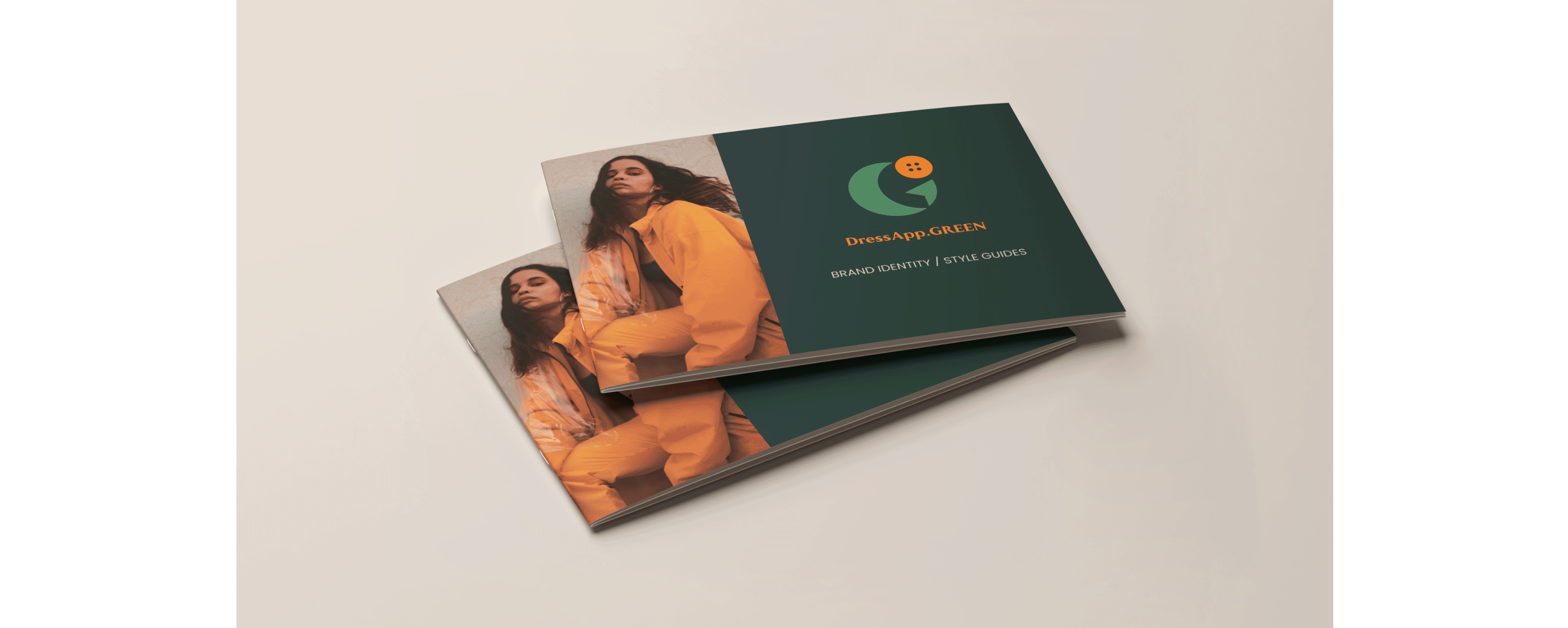
Brand Book
Once we have completed all stages of visual identity design, it is crucial to actively describe all elements in the brand book and provide additional instructions for adequately utilizing the design.
Results
The goal of creating a visual identity is that it be ageless and adaptable to any era, it shouldn't be affected by rapidly evolving trends. Once the visual identity has been developed, the brand is recognisable and memorable.
“ Async Labs has done an exceptional job. ”