BIGup
BIGup is a team that offers services to people passionate about big game fishing and boat excursion adventures.
Service
:Branding
Visual identity
Graphic design
Client
:BIGup
Date
:June 2022 – July 2022
About
If you are looking for a great place to go fishing, the BIGup team knows the best locations and spots where you will be able to experience the complete thrill of fishing. Whether you are a fan of Big Game Fishing, BIGup guarantees unforgettable summer adventures. Discover the Croatian islands of Pag, Premuda, and Lošinj on excursions that lead to beautiful beaches and swimming locations. Choose between promotional packages that include fishing equipment, delicious local food, and drinks. The goal of this team is to enable the fishing experience for everyone and to visit the beautiful places of Croatia along the way.
Challenge
The initial phase included discovering the client’s wishes. Questions that were asked gave insight into a better understanding of the brand and how the client wants to represent it to the world. The answers showed the brand’s central values, the main characteristics, the target group, the competition, the company’s goal, and why it exists. An insight was gained into the brand’s abstract values and the wishes that the client would like in the visual identity design.
After getting to know the brand, the main goal and challenge were to respect the client’s wishes while at the same time creating a memorable visual identity. We generated mostly typographical solutions at the client’s request. It was necessary to create typographic solutions that are not exclusively typographic but would have components that refer to the company’s leading service – fishing. During the discovery, it was mentioned that maybe a warm color like red should be included, although it didn’t seem like it would be a good representation of the brand.
Research & Mood Board
The next phase included research on the topic and analyzing the competition. Based on the research, a mood board was produced that contains photos that will be used as inspiration for the design, the client's wishes, a tentative choice of primary colors, and a secondary palette. The Mood board served as further inspiration and a guide for the uniformity of the brand.
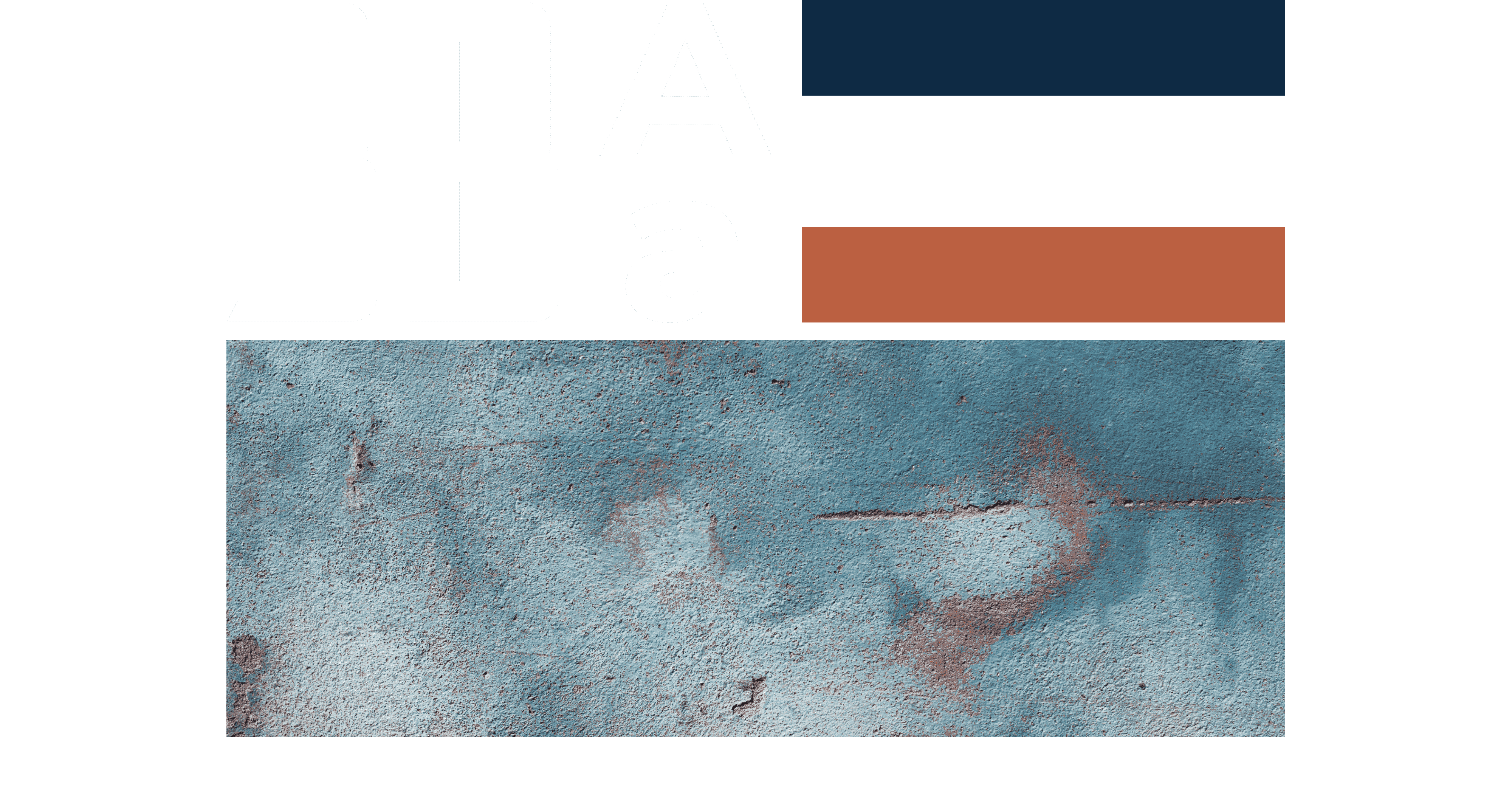
Colors
When choosing the color palette, we tried to use the proposed colors with colors that would show the feel of the brand, have a meaning behind them and tell the story of this team. As the primary colors, we chose a dark shade of blue, which indicates the depths of the sea, and white, which is associated with sea foam. For the accent color, a shade between orange and red was chosen, which indicates rust on old ships. A secondary color palette was also selected for possible subsequent brand needs. Using this accent color made it stand out from the competition. The warm color catches the eye among the "sea" of blue shades used by others in the same business, but it still captures the story and feels of the brand.
Typography
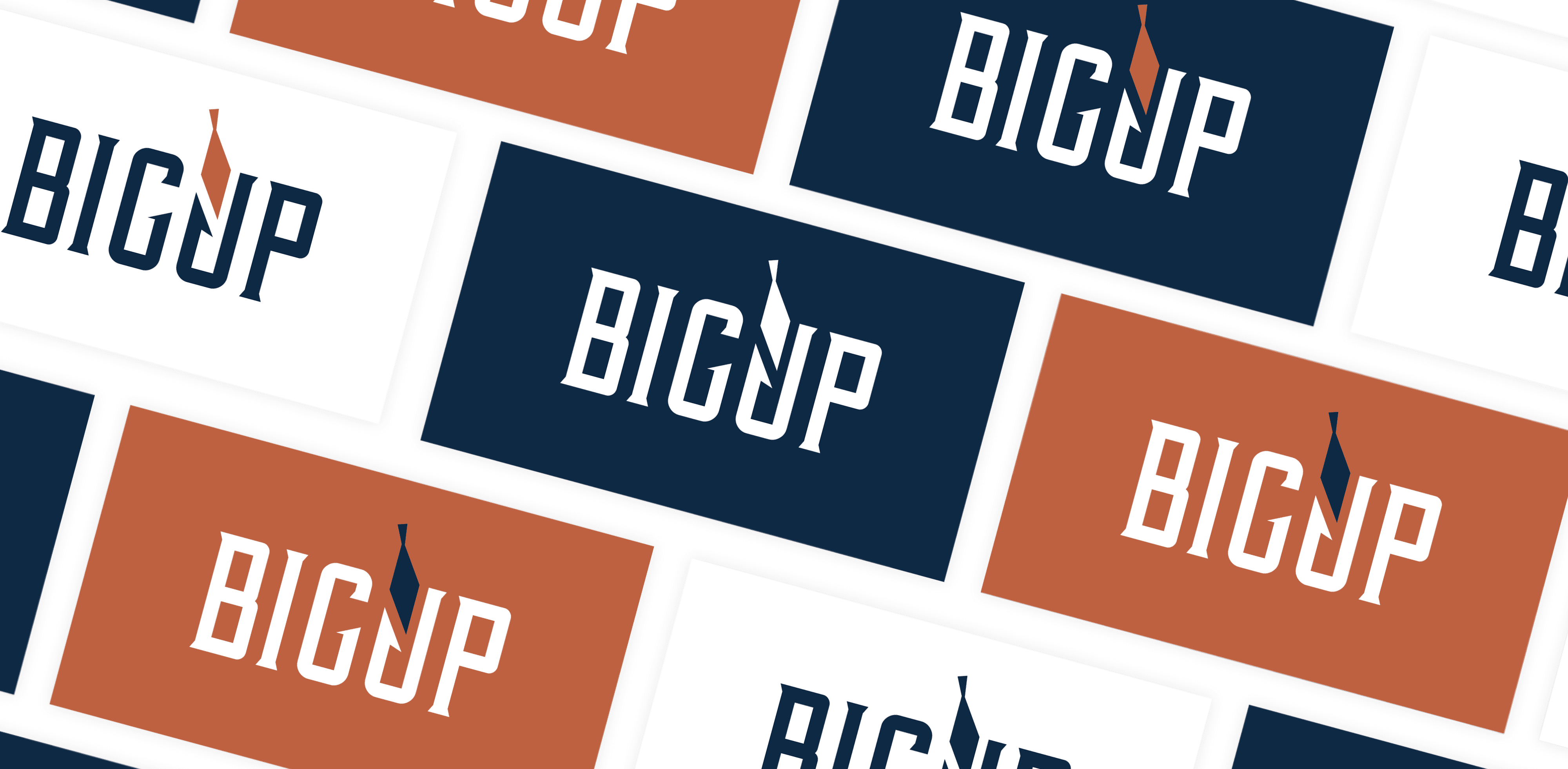
A display typography was needed to create a logo. Display fonts are part of a broad category and can generally be treated as such due to being used in large sizes, i.e., for headings. Display typography is used for large and emphasized titles and supertitles. After a thorough search of all available typefaces, the "Vintage Whiskey" font was chosen (among several others for secondary solutions that were not selected in the end), which gives off a luxurious old-fashioned feel. This elegant serif font has a classic casual feel reminiscent of old Dalmatian customs. It also matches well with the selected color palette, which aims to resemble deep parts of the sea and rust on ships. It also appeals to the target group, which mainly consists of men.
Typography in the regular cut is used for running text, bold for headings, and italics for quotes and highlighted text. The "Montserrat" font was chosen as the primary typography, which is a sans-serif font contrasting to the display typeface. It also gives the brand a more modern feel and is legible and easy to use in all applications (print and digital).
Logo
Choosing colors and typography was followed by sketching various motifs associated with fishing, such as fish, hook, boat, etc. We selected several different typefaces and implemented these motifs. Then we generated a dozen sketches and presented them to the client. After consideration, we continued with three solutions, finally rendered in digitalized vector form.
The three final solutions were presented in the environment of the brand's colors, on different backgrounds. In this way, the client can get a correct perception of the offered solutions and make the right decision. After carefully examining, the client chose a solution emphasizing big fishing and the accommodation included in the offer. The letter “U” inside the logo has been modified to resemble a fishing hook. And in the continuation of the hook, the shape of a fish follows the typography. The fish was “caught” on the hook. The letters “G” and “U” also have a distorted house shape, which is associated with the accommodation available in the offer.
The logo then goes through stages of refinement. For the logo, we defined clear space and modified the letter "U" and the detail of the fish. This was followed by exporting all logo versions in every type of document that the client might need.
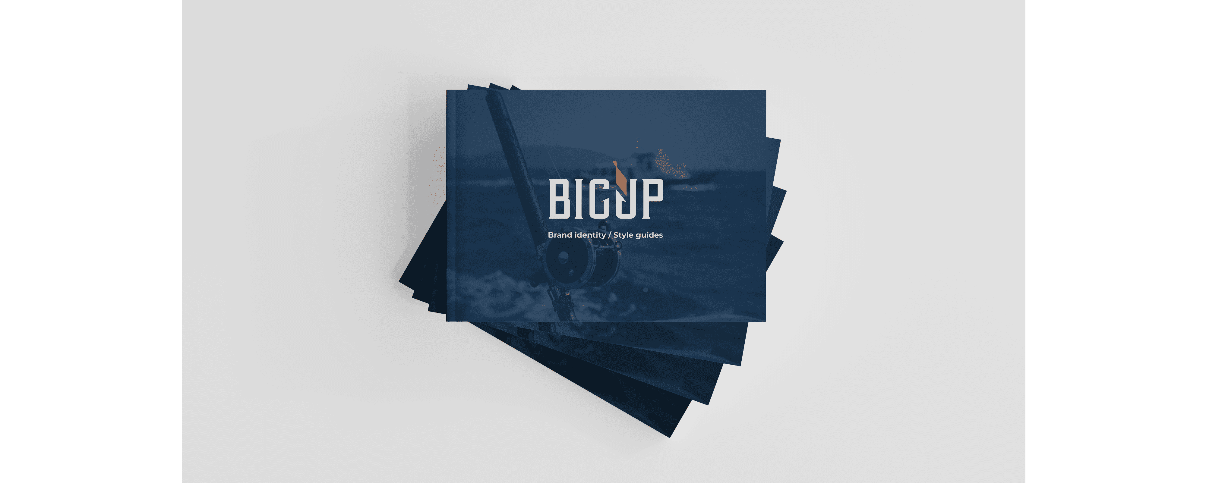
Brand Book
After completing all stages of visual identity design, it is necessary to define all items in the brand book as further instructions for using the design to avoid brand inconsistency. The brand book describes the brand, explains the clear space of the logo, defines the colors (digital and print), shows all permitted versions of the logo, shows the design applied to the company's business documents, the typography that may be used and the application to promotional materials.
Flyers and posters
Flyers and posters were created as promotional materials for the summer tourist season. By using the fish motif from the logo, surfaces were created on which images were applied. We obtained eye-catching results using the colors defined in the brand book and images.
Results
The goal of creating a visual identity is that it is timeless and can work in any period because the process is complicated, and it is not profitable to change it after a short time. Therefore, it should not be subject to constantly changing trends. A timeless identity has been created that can be used for many years regardless of trends. The visual identity is the first thing with which the brand is presented. According to it, we get the brand's first impression. That is why it is necessary to tell the brand's story through visual presentation. At the end of the process of creating a visual identity, we have a recognizable and memorable brand.