DotHub - IOTification of electronic key
DotHub is an automation platform that replaces a variety of remote controllers within a single device and app. This platform provides easy to use hardware for IOTification of almost every electronic key or electrical interface.
Services
:Brand Identity / UX Design / UI Design
Client
:Zero Molecule d.o.o.
Date
:Dec 2020 – Jan 2021
About
DotHub core idea is cloud solution provides full control and telemetry data, so users can manage each device and monitor its state.
With the DotHub platform, there is no need for numerous remote devices, as users can easily control all of them within a single device and app on their phone.
While it can be used as a perfect home automation solution for opening gates and barriers, DotHub also opens one more important thing: many possibilities in the industry.
DotHub vision of the future is automated and shared mobility between people, MaaS and transport service providers connected as dots in the “DotHub network.”
Challenge
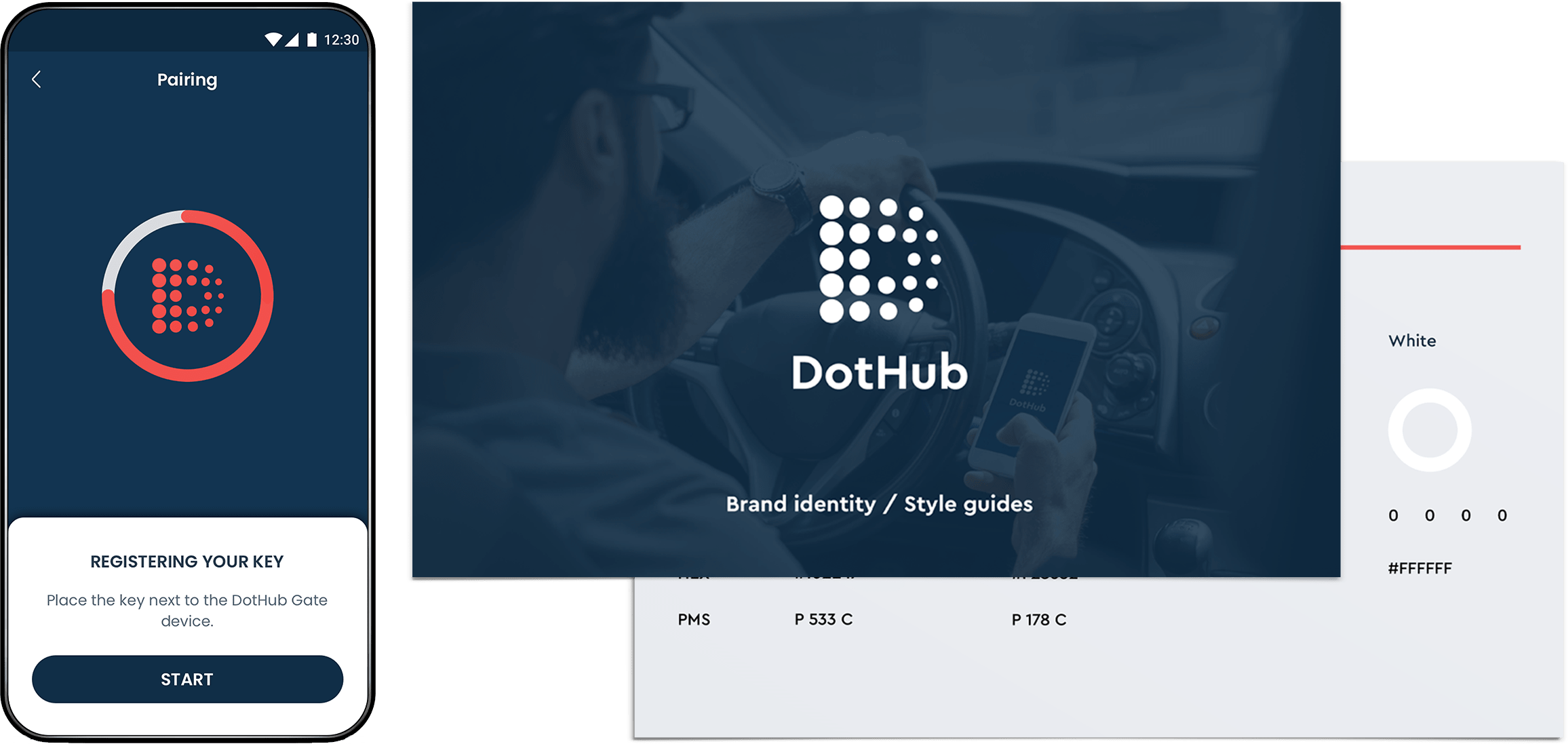
Behind the DotHub solution is the Zero Molecule team. Our client knows that successful project ideas need an attractive visual identity and professional style guide for future steps of implementation. We’ve been responsible for creating the DotHub logo and brand book, based on their vision and our research.
The second part of the client’s requirements was the user interface design. The user interface should be designed for iOS and Android platforms and deliverable for a Flutter environment.
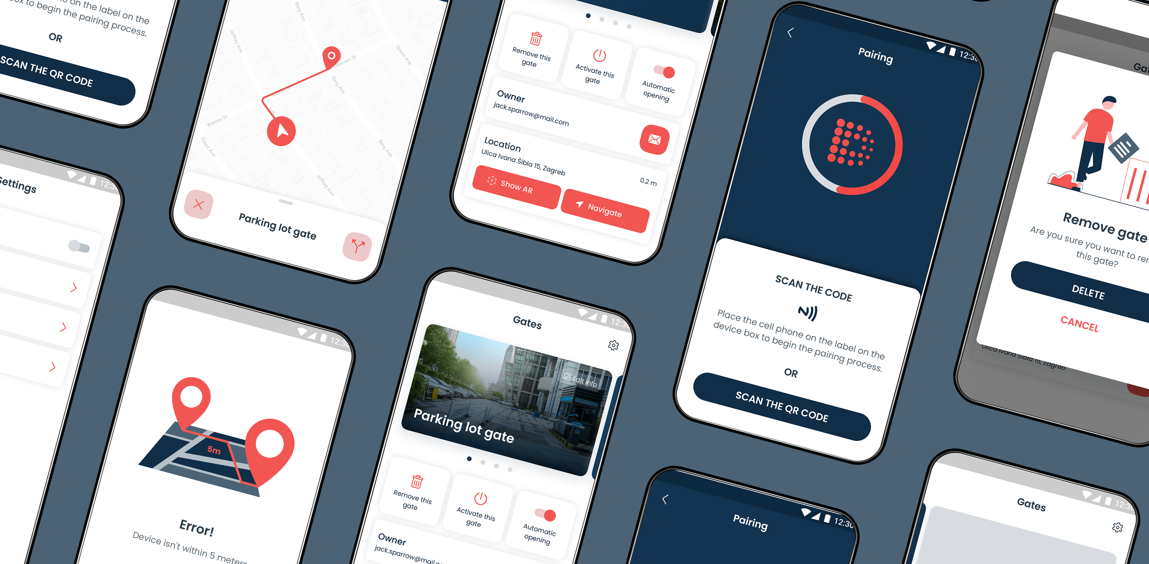
According to the existing UX guidelines, the user interface should display the mobile application’s core features: user login, device pairing, adding new devices, and manipulations on added devices. The design should be clean, modern and indicate the main functionality of the mobile application.
Visual identity
Because the idea of DotHub is to manage many remote devices within a single mobile application, the logo represents dots gathered in a single center in the shape of the letter “D”. A brand book, or a brand style guide, is a document that sets specific guidelines for perpetuating brand identity in all external and internal communications. In the brand book, we described the use of the DotHub logo, color, the use of typography, and image manipulation.
- Logotype design
- Brand development
- Brand Guide
UX & UI design
In keeping with the visual identity, we have created a UI style guide that defines components, icons, colors, typography, and animations for the mobile application interface. The next step was to create screens for user onboarding, registration/login, device pairing, the main screen with added devices, settings, etc. The UI clearly broadcasts the mobile application's essential features, and special attention is paid to creating simple and straightforward steps for pairing remote devices. By connecting the designed screens, we made a design prototype of a mobile application.
- UX design
- UI design
- Prototype
Results
We have successfully defined the project's visual identity, with a logo representing the central vision of the DotHub platform. The professional visual identity attracted the attention of project investors and gave visual impetus to the initial idea.
A modern and simple user interface meets the needs of target users for this type of mobile application. Consistent design with a functional design system allowed the easy client implementation of design in a Flutter environment. Our design team was supportable and suggestible for new requests and changes in the development phase of the mobile app.