
D3.js is a Javascript library for data-driven DOM manipulation. This is a generic sentence, but when you look at the sheer amount of examples in their repository, it starts to make sense.
We are sure most of you reading this article already heard about D3.js. So what’s the point of this article? It’s intended for people who never used D3.js and wanted to create something interesting.
Throughout the article, we are assuming a basic knowledge of HTML, CSS, Javascript, and Web Development. If you are just interested in the demo or you want to know if this article is worth it, check it out here.
What we need to do before we start this d3.js demo?
Before we can visualize anything, we need some data to visualize. For this example, we picked the Olympic history of athletes dataset from kaggle.com. Dataset is a .csv file about ~41MB in size, which could be too big for the browser to handle. But in our opinion, it’s better to start with some interesting data and not worry about the dataset’s size. That way, when you see the final result, you can feel more of an accomplishment and then optimize accordingly.
Premature optimization is the root of all evil, as they say. So what do we need to start? You honestly need only one .html file, one .css file, and one .js file. But to speed up the development process, we’ve used Webpack to bundle .js files and parse .scss files to .css.
In the end, it doesn’t matter that much in this example, this is just personal preference, you can poke around my Webpack setup in this example repository. If you don’t want to use any of that, you can simply at the bottom of your .html file paste the following code.
<script src="https://d3js.org/d3.v5.min.js"></script>
<script src="https://cdnjs.cloudflare.com/ajax/libs/crossfilter2/1.4.6/crossfilter.js"></script>
<script src="dist/main.js"></script>
The first script is a D3.js library, and the second script is a Crossfilter library, which we are using for filtering data. Crossfilter is definitely not necessary here, but it provides many functionalities that help us get to visualizations quicker, once you get the hang of it.
Last is our script we are going to write through this tutorial. We won’t write the CSS used here, since that would be too detailed. You can always download my dist/main.css from the repository, or create your own .css file for this example. As said in the intro of the post, we’ve assumed that the person reading this post has a basic understanding of Web development, which means you have already created the index.html file.
What can you do with D3 JS?
Let’s start visualizing using d3.js:
Before we start anything with data, we need to create a basic HTML structure that will hold all of our charts. For this example, you can just copy the following code into your index.html file between body tags.
<div class="c-charts">
    <div class="c-chart" id="yearAthletesCountChart">
        <h3>Number of athletes per year (seasons combined)</h3>

    </div>
    <div class="c-chart" id="weightHeightChart">

    </div>
    <div class="c-chart" id="ageYearChart">

    </div>
    <div class="c-chart c-chart--half" id="medalsPieChart">

    </div>
    <div class="c-chart c-chart--half" id="medalsByCountryPieChart">

    </div>
</div>
This will serve as containers for charts that we will create with D3.js. But they are empty for now. So how do we fill them? Well, the first step is to get the actual data from the .csv file into our code. In index.js file, copy this code.
// assets/js/index.js
(function () {
  d3.dsv(',', '/assets/data/athlete_events.csv', function (row) {
    return {
      name: row['Name'],
      sex: row['Sex'],
      age: row['Age'] !== 'NA' ? +row['Age'] : null,
      height: row['Height'] !== 'NA' ? +row['Height'] : null,
      weight: row['Weight'] !== 'NA' ? +row['Weight'] : null,
      team: row['Team'],
      games: row['Games'],
      year: +row['Year'],
      season: row['Season'],
      sport: row['Sport'],
      event: row['Event'],
      medal: row['Medal']
    };
  }).then(function (athletes) {
    let dashboard = new DashboardComponent(athletes);
    dashboard.init();
  });
})();
So what does this code do? d3.dsv() loads the data from the .csv file located on the path in the second parameter. First parameter is delimiter of .csv file. The last parameter is a callback that receives the raw parsed row of a .csv file as the object, and the return value is parsed JSON object we will use throughout our code.
As you might have noticed, there are plus operators before some of the row attributes. The thing is, when D3.js parses the .csv file, everything inside of it is a string. So if we want to transform numbers saved as strings to Javascript Number, we use the plus operator, which casts it to Number. For height and weight, we added an extra check for athletes who don’t have that data.
After we load every row into one big array, we pass it off into what we call DashboardComponent. If you are not using Webpack, you can simply create a function that gets a variety of data as the parameter.
Let make a simple line chart
What is a line chart? We have two axes, one vertical, one horizontal, and between them, there is a line that connects all the points. Really simple. Before we create a chart, we need to filter the data. When we say filter, we mean tie number of athletes to year. For that, we will use Crossfilter, which is helpful in filtering and group data in large arrays. But just to be clear, Crossfilter is needed only because we want to get to visualizations quickly; you can do all this with normal array filtering or however you choose.
So how do we filter the array of athletes with Crossfilter so we can have years on one axis, and a number of athletes in that year?
First, we create DashboardComponent that in the beginning looks like this:
// assets/js/DashboardComponent.js
export default class DashboardComponet {
  constructor (athletes) {
    // We don't store athletes
    this.athletes = crossfilter(athletes);
  }

  init () {
    this.initYearAndAthletesCountChart();
  }

  initYearAndAthletesCountChart () {
    let numberOfAthletesPerYearChart = new NumberOfAthletesPerYearChart(this.athletes);
    numberOfAthletesPerYearChart.render();
  }
}
DashboardComponent doesn’t do anything by itself, except creating a new object for NumberOfAthletesPerYearChart, and calls the method to render the chart. So the next step is to create NumberOfAthletesPerYearChart. Since we are passing the whole Crossfilter array to the component, it makes sense to create class and constructor first.
// assets/js/charts/NumberOfAthletesPerYearChart.js
export default class NumberOfAthletesPerYearChart {
  constructor (athletes) {
    this.athletesDimension = athletes.dimension(function (athlete) {
      return athlete.year + athlete.season;
    });
    this.createGroupFromDimension();
    this.chartContainer = d3.select('#yearAthletesCountChart');
    this.chart = null; // This will hold chart SVG Dom element reference
    this.chartWidth = 960; // Width in pixels
    this.chartHeight = 400; // Height in pixels
    this.margin = 50; // Margin in pixels
    this.chartHeightWithoutMargin = this.chartHeight - this.margin;
    this.countScale = null;
    this.yearScale = null;
    this.tooltipContainer = null;
  }

  createGroupFromDimension() {
    // ... TODO
  }
}
What is Crossfilter dimension?
We aren’t saving Crossfilter array anywhere concretely, but we are first creating a dimension that we will use to aggregate our data. The dimension we are using in the Olympic Games description, which consists of year, and season (summer or winter).
Dimension means that we are selecting one attribute (either the actual attribute or derived) to be used as the basis for filtering and grouping of data. The second line in the constructor creates the group based on dimension, which we will cover a little bit later. After that, we select the chart container with D3, just a DOM element from index.html.
We leave a few properties defined to be null, which we will fill in later as we go through the example. We are explicitly setting chartWidth, chartHeight, margin and chartHeightWithoutMargin, so we have those settings defined in one place.
Usually, you can set up those values to be calculated dynamically from the available viewport before the rendering of the chart starts. Still, we’ll ignore that part, for now, so we focus only on building our Dashboard.
What is JSON format example?
Currently, every entry in our dimension has this JSON structure:
{
  age: 28,
  event: "Fencing Women's epee, Team",
  games: "2016 Summer",
  height: 168,
  medal: "Bronze",
  name: "Olga Aleksandrovna Kochneva",
  season: "Summer",
  sex: "F",
  sport: "Fencing",
  team: "Russia",
  weight: 58,
  year: 2016
}
So what is that group we were talking about above? The whole point of Crossfilter is to enable easier grouping and filtering of data. We want to get a smaller array of grouped data where the array element key is the name of the Olympic Games in question, and the value of that array element is the number of athletes competing in the event, which looks like this.
{
  key: "1988Summer",
  value: {
    count: 12037,
    season: "Summer",
    year: 1988
  }
}
This brings the array of thousands and thousands of entries to just 51 elements, which we will use to display data in our chart. How do we shrink that array to a group? Well, we could simply use:
// Easier option, but not what we want
this.numberOfAthletesPerYearGroup = this.athletesDimension.group().reduceCount();
Which will return us JSON object for each new entry, that looks like this:
{
  key: "1988Summer",
  value: 12037
}
But that is not what we want. Built-in reduceCount() function only returns count, which we can effectively use, but we need year and season in the value and in the grouped result. So we need to create custom grouping logic in our createGroupFromDimension() method.
  // assets/js/charts/NumberOfAthletesPerYearChart.js
  createGroupFromDimension () {
    this.numberOfAthletesPerYearGroup = this.athletesDimension.group()
      .reduce(
        // reduceAdd()
        (output, input) => {
          output.count++;
          output.year = input.year;
          output.season = input.season;
          return output;
        },
        // reduceRemove()
        (output, input) => {
          --output.count;
          output.year = input.year;
          output.season = input.season;
          return output;
        },
        // reduceInitial()
        () => {
          return {year: null, season: null, count: 0};
        }
      )
      .order(function (p) {
        return p.count;
      });
  }
To create the group, first, we call group() method on our dimension, which creates the group. After that, we need to provide a way to reduce the bigger array to a smaller array of groups. For that, we use reduce() method, where we send three callbacks, first is reduceAdd(), or what happens when an array element is added to the group. The second is reduceRemove(), which controls what happens when we remove something from the group array. The last callback is reduceInitial(), which creates an empty group element when a new group is needed.
The last chain call on a group is order() method, where we order groups by count, descending by default. After we create the group, we can always console log, either on dimension or group, method top(Infinity), to see the resulting array. So our final group array will look like this:
[
  {
    "key": "2000Summer",
    "value": {
      "year": 2000,
      "season": "Summer",
      "count": 13821
    }
  },
  {
    "key": "1996Summer",
    "value": {
      "year": 1996,
      "season": "Summer",
      "count": 13780
    }
  },
  // ... The rest of elements
]
So, for now, we have explained what does constructor of NumberOfAthletesPerYearChart does. If we remember, after that we call render() a method on the component. It’s very simple, and self-describing, so we will just continue to explain each of the 5 methods inside render() the method.
// assets/js/charts/NumberOfAthletesPerYearChart.js
render () {
  this.createSvg();
  this.initScales();
  this.drawAxes();
  this.drawLine();
  this.drawPoints();
}
To draw a chart on the screen, we first need to create an SVG DOM element to hold the chart.
  // assets/js/charts/NumberOfAthletesPerYearChart.js
  createSvg () {
    this.chart = this.chartContainer
      .append('svg')
      .attr('width', this.chartWidth)
      .attr('height', this.chartHeight);
  }
Since we already have chartContainer reference, we simply use the D3 method append('svg') to add SVG DOM element to chartContainer, and then set attributes of that SVG, based on values we defined in the constructor of NumberOfAthletesPerYearChart. SVG will for now be empty, but soon we will fill it with chart elements.
The next thing we want to draw on screen are axes of our chart, which will contain years on the horizontal axis, and a number of athletes on the vertical axis. Before we do that, we will set up one of the best features of D3 – scales.
A D3 scale is a function that allows us to translate values from domain range to some other arbitrary range. In our use case, that range will be the number of pixels available for the chart. So that way we have a straightforward way always to determine where on our chart, for example, the year 1994 belongs.
  // assets/js/charts/NumberOfAthletesPerYearChart.js
  initScales () {
    // TODO potentially unsafe, if top() returns []
    let maxCount = this.numberOfAthletesPerYearGroup.top(1)[0];
    let chartWidth = +this.chart.attr('width') - this.margin;
    let chartHeight = +this.chart.attr('height') - this.margin;

    this.countScale = d3.scaleLinear().domain([0, maxCount.value.count]).range([chartHeight, this.margin]);
    // TODO We are hardcoding years for now
    this.yearScale = d3.scaleLinear().domain([1896, 2018]).range([this.margin, chartWidth]);
  }
To create scale, first, we need to get minimum and maximum values from our domain, which is contained in our data, and minimum and maximum values for our range, which in this case are the minimum and a maximum number of pixels in which we can draw inside the chart.
So for the vertical axis or number of athletes axis, we know the minimum value is 0. Since the group array is sorted descending by the number of athletes, we just need to get the first element in that array, and it will hold the maximum count.
Chart width and chart height are our range values, but we subtract margin from them, so our chart has more space close to the edges, so axes are shown in full. After we get through this example, you can play around with the changing value of margin, and see how it affects the chart layout. We create a number of athletes scale with d3.scaleLinear().domain().range() a method chain. For domain, we pass 0 and maximum count of athletes, and for the range, we pass chart height and this margin. It’s important to note that the first element of the range array is height, which is a bigger number, since (0,0) in the D3 coordinate system is in the top left corner of SVG.
The second element is our chart’s margin, so the axis, when it’s drawn, it’s drawn from the bottom left corner to the top left corner. You can always play around with switching the order of those two values to see how it affects the drawing of the chart.
For the year scale, in the domain, we use already known values, since it’s easy to know in what year did the Olympic Games start. For range, we set the scale to start at the left margin and end at chartWidth variable, which we calculated few lines before. Now we can get to the actual drawing of axes to chart.
  // assets/js/charts/NumberOfAthletesPerYearChart.js
  drawAxes () {
    let countAxis = d3.axisLeft(this.countScale);
    let yearAxis = d3.axisBottom(this.yearScale);

    this.chart
      .append('g')
      .attr('class', 'c-axis')
      .attr('transform', 'translate(' + this.margin + ', 0)')
      .call(countAxis);

    this.chart
      .append('g')
      .attr('class', 'c-axis')
      .attr('transform', 'translate(0, ' + this.chartHeightWithoutMargin + ')')
      .call(yearAxis);
  }
In the first two lines of the method, we create both D3 axes by using d3.axisLeft() and d3.axisBottom() methods. The only difference between them is orientation. Since where the axis will be drawn is decided by attributes we set later, orientation means if axis line will be vertical or horizontal and whether ticks and text will be drawn before or after the line.
For more about the customization of the axes generator, you can read more here. To draw generated axes on our chart, we first use the already known append() function of our chart and append the group element.
You don’t need to append a group, but it’s helpful to organize your elements in groups. Especially if your chart starts to get really complicated, it could save you a lot of trouble later. We added the class for styling and transform attribute to both of those groups, which sets where the axis will be drawn.
And last we call the axis on that group so we actually draw axis inside that group. And finally, after all this writing of mine, we finally get to the meat, which is we get something drawn on the screen. It could look something like this (depending on the .css file you are using). It’s not much yet, but it’s something to start with.
What’s left to do? Our chart line and our chart points. Let’s start with the chart line.
// assets/js/charts/NumberOfAthletesPerYearChart.js
  drawLine () {
    let line = d3.line()
      .x((d) => {
        return this.yearScale(d.value.year);
      })
      .y((d) => {
        return this.countScale(d.value.count);
      });

    this.numberOfAthletesPerYearGroup.order((d) => {
      return d.year;
    });

    this.chart
      .append('g')
      .attr('class', 'c-line')
      .append('path')
      .attr('d', line(this.numberOfAthletesPerYearGroup.top(Infinity)));
  }
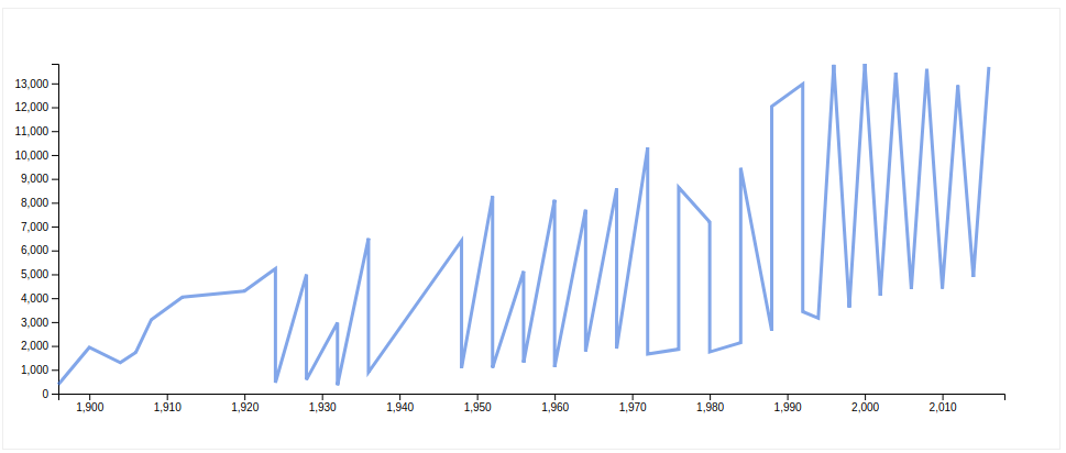
First, we create d3.line(), which is simply a definition of a function that will take input data and assign x & y values to each element in an array. The good thing about d3.line() is that it can provide various levels of interpolation between each data point, which we will not use in this example, but it’s always available for customization.
After that we order the group on year attribute, so we don’t have the line that goes nicely from left to right. And lastly, we append another group to chart and append the path element to it. For the path to show anything we need to set its d attribute, which is the result of our line function. We just pass our group data to the line, and then we can execute code to see the result.
Let’s get to drawing the points.
// assets/js/charts/NumberOfAthletesPerYearChart.js
this.chart
      .append('g')
      .attr('class', 'c-points')
      .selectAll('circle')
      .data(this.numberOfAthletesPerYearGroup.top(Infinity))
      .enter()
      .append('circle')
      .attr('cx', (d) => {
        return this.yearScale(d.value.year);
      })
      .attr('cy', (d) => {
        return this.countScale(d.value.count);
      })
      .attr('r', '5');
First, we append another group to SVG, and then we select all circle elements inside it. After that, we use the d3 method chain data().enter() where we send an array of our data and execute code after enter() N times, where N is the length of the array we provided. In this example, N = 51, so that means we will append 51 circles, where their cx and cx positions will be calculated from the scale we defined earlier. For each circle, we set r or radius to 5 pixels. When we execute this code we will get a chart that looks like this:
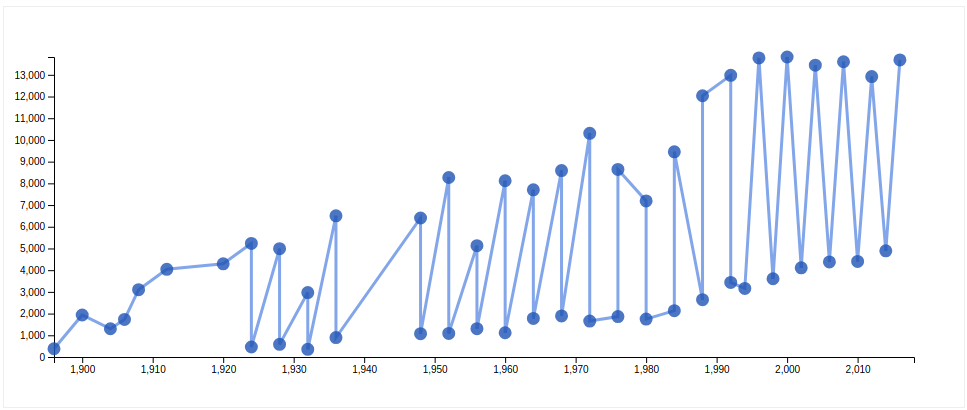
We finally have our chart. Maybe it looks different in your browser if you didn’t use my .css file, but looks like a chart. We are almost done with our first example. But one thing is still missing, we have points but we don’t know what those points mean, it would help a lot if we had some tooltip that shows us what each point means. So for that, we can use the following code:
  drawPoints () {
    // ... Part before this line stays the same
      .attr('r', '5')

      .on('mouseover', (d) => {
        this.showTooltip(
          d.value.year + ' ' + d.value.season + ': ' + d.value.count,
          d3.event.pageX,
          d3.event.pageY
        );
      })
      .on('mouseout', (d) => {
        this.hideTooltip();
      });
  }

  createTooltipIfDoesntExist () {
    if (this.tooltipContainer !== null) {
      return;
    }

    this.tooltipContainer = this.chartContainer
      .append('div')
      .attr('class', 'c-tooltip');
  }

  showTooltip (content, left, top) {
    this.createTooltipIfDoesntExist();

    this.tooltipContainer
      .html(content)
      .style('left', left + 'px')
      .style('top', top + 'px');

    this.tooltipContainer
      .transition()
      .duration(200)
      .style('opacity', 1);
  }

  hideTooltip () {
    this.createTooltipIfDoesntExist();

    this.tooltipContainer
      .transition()
      .duration(500)
      .style('opacity', 0);
  }
First, we need to add mouseoverandmouseout event handlers to each point we added to the chart. In mouseover we need to show the tooltip, for which we are using showTooltip() method, where we send content as a first argument or text that will be displayed inside the tooltip.
The second two attributes are left and top positions of the tooltip, which are CSS attributes. This means for this implementation to be shown as it should, the tooltip container should have position: absolute; CSS style. We are aware this maybe isn’t the best practice because it combines presentation and logic inside a script that generates the tooltip, but we hope you all will find strength in your heart to forgive us for that sin.
Left and top position values are calculated from the d3.event object, which is a special object that contains event data, and should only be used inside event handlers since that’s the only time it holds data. If you noticed, in both showTooltip() and hideTooltip() there is a call to createTooltipIfDoesntExist(), which simply checks if tooltipContainer exists, and if not, it creates it for use.
And that’s it, we have a fully functioning line chart. When started writing this, we thought this would be a small post about creating a line chart. Along the way, we added a bigger dataset and then we went into the Crossfilter territory when grouping large data sets.
We hope now you have at least a basic idea of how to visually show grouped data of ~271k rows of data. You can always check out the demo to see how it works in action. Creating the rest of the dashboard, and adding interactivity, we will cover in future posts. Stay tuned.
We are recognized as a top Software Development Company on DesignRush!