The importance of principles and elements of graphic design: What does it take to create a successful design piece?
Graphic design is more than just making things look pretty. It’s about creating effective visual communication that effectively delivers your message to your intended audience.
At its core, graphic design is about structure and form. It’s about understanding how shapes, colors, and typography create the desired effect.
In this article, we’ll cover principles and elements of graphic design that every designer must understand and comprehend to deliver outstanding designs.
What are graphic design principles?
The principles and elements of graphic design guide designers, providing a roadmap to crafting visually captivating works. By adhering to these rules, designers can effectively convey their intended message well-structured and functionally.
Whether for advertisements, websites, logos, videos, banners, social media, product design, or web content, the goal is to make highly shareable content and captivating design.
We, humans, are visual creatures and visual learners. Following basic design principles and elements is essential to make a stunning design.
Compliance with rules and principles gives the designers security in their work. This helps designers know about each component of their solution, why it is in the visual, its purpose, why it is in a certain position, and that they are on the right track and doing a good design.
What are the main principles and elements of graphic design
A few fundamental principles and elements of graphic design are essential for creating visually appealing and compelling compositions in graphic design. Here are 7 main principles:
1. Balance
Balance is the principle of graphics and layout that refers to the proper arrangement of elements, which gives a visual weight for the design. Achieving equilibrium in the layout by distributing visual elements evenly.
Balance/visual balance in design can be achieved in different ways:
Symmetrical (elements are mirrored on both sides):
Symmetrical balance is essential for creating more formal designs. Although this way is the best for establishing balance, it can be boring/unattractive. To avoid this, the designer can be more creative with defining visual elements in a symmetrical layout.
Asymmetrical (elements are balanced through contrast and visual weight):
Asymmetrical balance typically creates a more dynamic and energetic impression. For example, several smaller elements on one side balance one large element on the drudge side. It’s not dull, and you can make an exciting arrangement of elements.
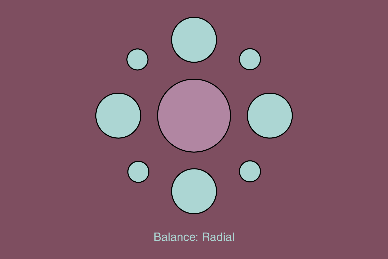
Radial
The elements are balanced according to one point. They “radiate” from the central point and can be located at different distances.
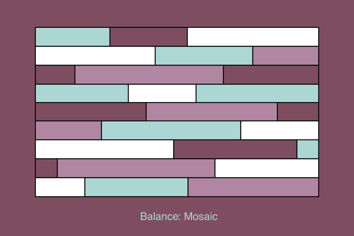
Mosaic
Mosaic is a rarely used type, similar to symmetrical, but the elements are placed in a predefined layout, such as a grid, so the user observes the entire field where the elements are placed, not from some central point. It’s like an “organized mess”.
People are attracted to balance because balance is associated with security and stability, while imbalance causes discomfort and confusion.
2. Hierarchy
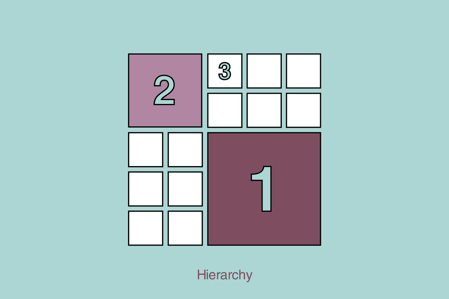
Hierarchy is a fundamental principle in graphic design that involves arranging visual elements to guide the viewer’s attention and effectively communicate information. It helps create a clear and organized visual structure, allowing the viewer to quickly understand the relative importance of different elements within a design.
In essence, hierarchy helps to establish a visual order by assigning varying levels of emphasis, significance, and importance to different elements. This enables the viewer to navigate and interpret a design’s content more easily. Hierarchy is achieved by size, contrast, whitespace, color, alignment, typography, and proximity.
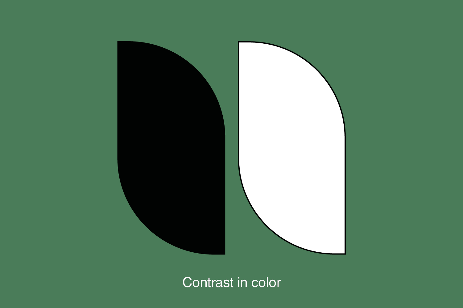
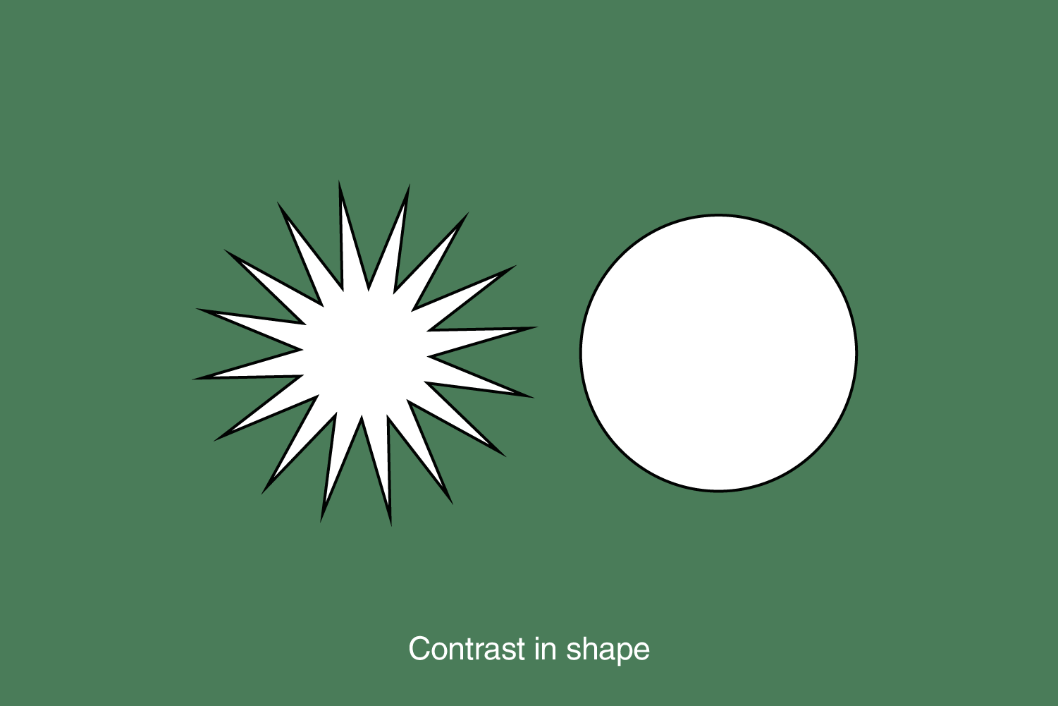
3. Contrast
Contrast is the difference between two or more elements in the design. It refers to the difference between light and dark elements, boldness, or subtlety in color. The contrast in design is often associated with legibility (typography on the background) and accessibility (an essential element is visually available before the least important).
The most crucial element in the design should have the highest contrast (for example, a distinctly blue button on a white background with much white space is of high contrast).
It’s about creating apparent differences between design elements such as typography, shapes, and imagery. Contrast significantly increases the impact and success of a design piece. Creating visual interest by juxtaposing elements with noticeable differences, such as color, size, shape, or texture. Contrast helps highlight important elements and adds dynamism to the design.
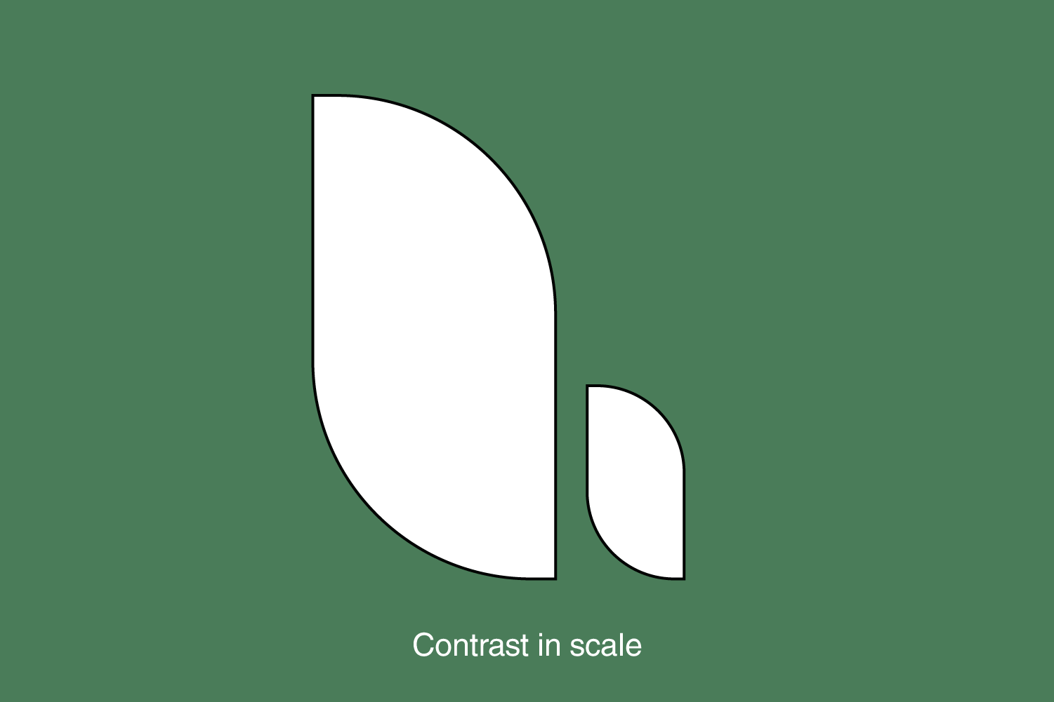
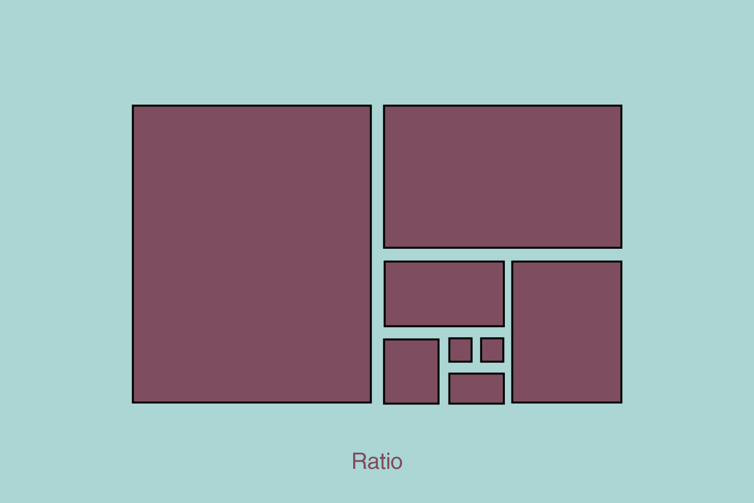
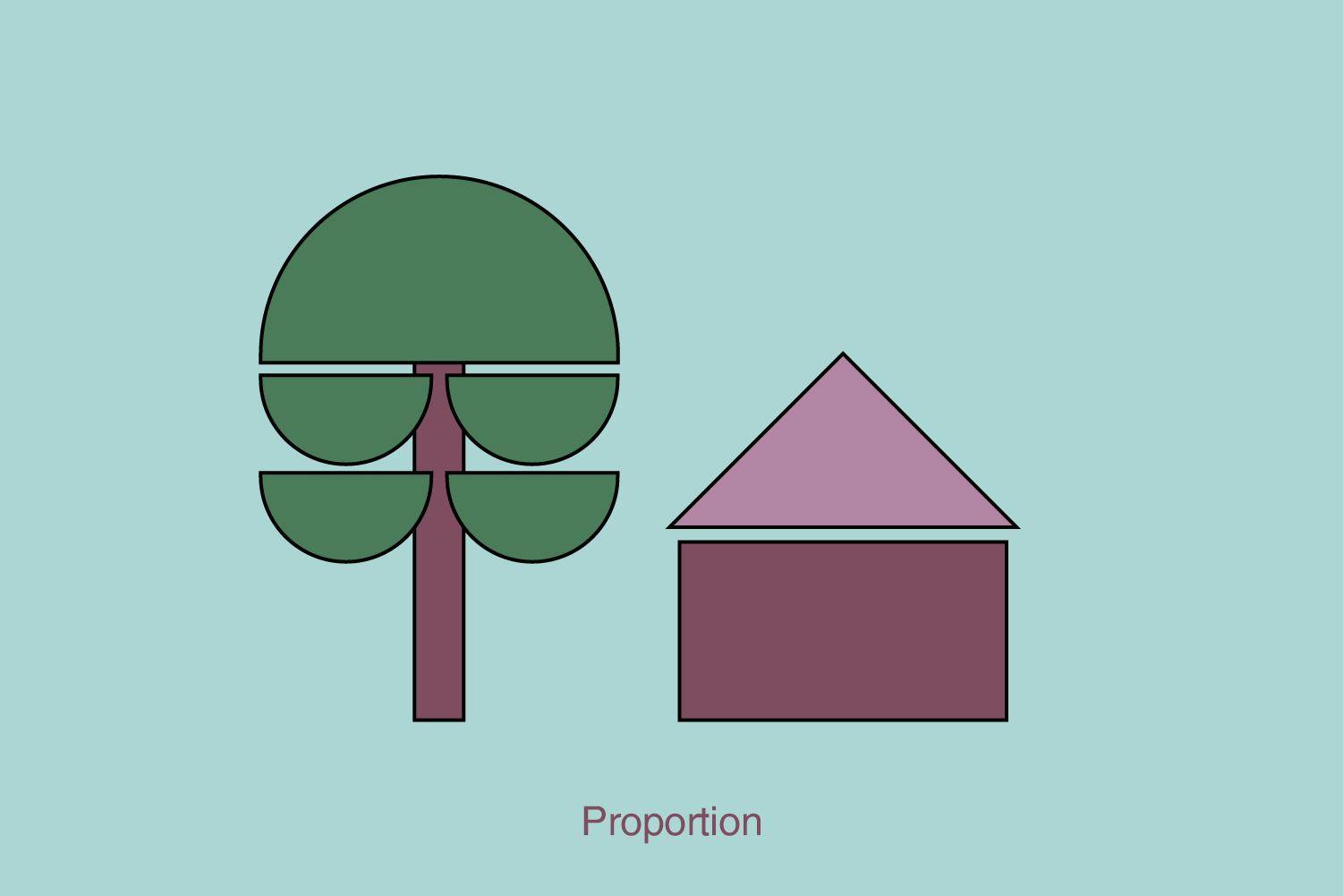
4. Proportion and scale
Proportion and scale ensure that elements’ sizes and ratios are visually pleasing and well-balanced. Shapes and sizes should complement each other to create a cohesive and aesthetically pleasing design. This also impacts the hierarchy. A larger element will get the user’s attention before a more minor element.
Appropriate proportion and scale help establish relationships between elements and maintain visual harmony.
On the other hand, this rule is important for scale drawing. Suppose the designer places a specific element on a smaller surface and wants to keep the natural size of that element (for example, a tree will be bigger than a man, proportionally as it is in the natural environment). Additionally, the digital design utilizes the rule of proportions to position the design across various device dimensions, allowing the placement of the same design on a screen that is 2x smaller.
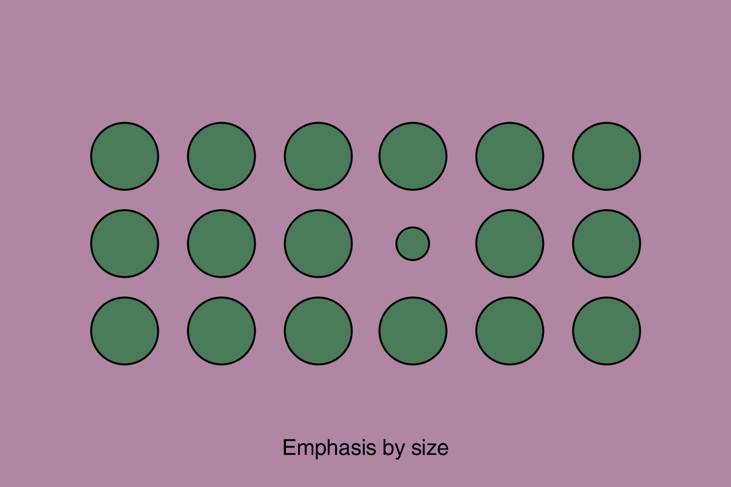
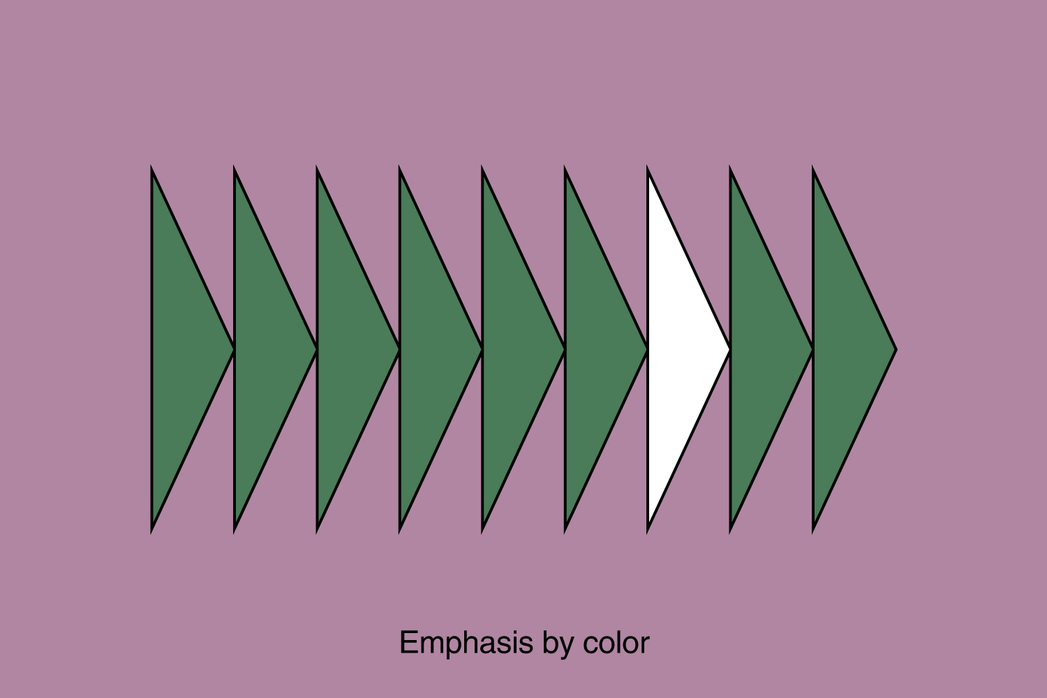
5. Emphasis
Emphasis involves highlighting certain elements of a design to create a focal point. Directing the viewer’s attention to a specific focal point or key element within the design. Emphasis is crucial for guiding the viewer’s gaze and conveying the primary message.
Emphasis can be achieved by size, weight, position, color, shape, and/or style. It refers to the dominance of a specific element over all other elements. It is similar to contrast, but there is a difference because contrast refers to the difference between two elements, and emphasis refers to the influence of a certain element on other elements – and they can be used simultaneously.
The highlighted or dominant element naturally draws the user’s initial attention. Yet, it’s imperative to strike a balance. The emphasized element mustn’t overwhelm the overall design to the extent of causing an imbalance.
6. Repetition
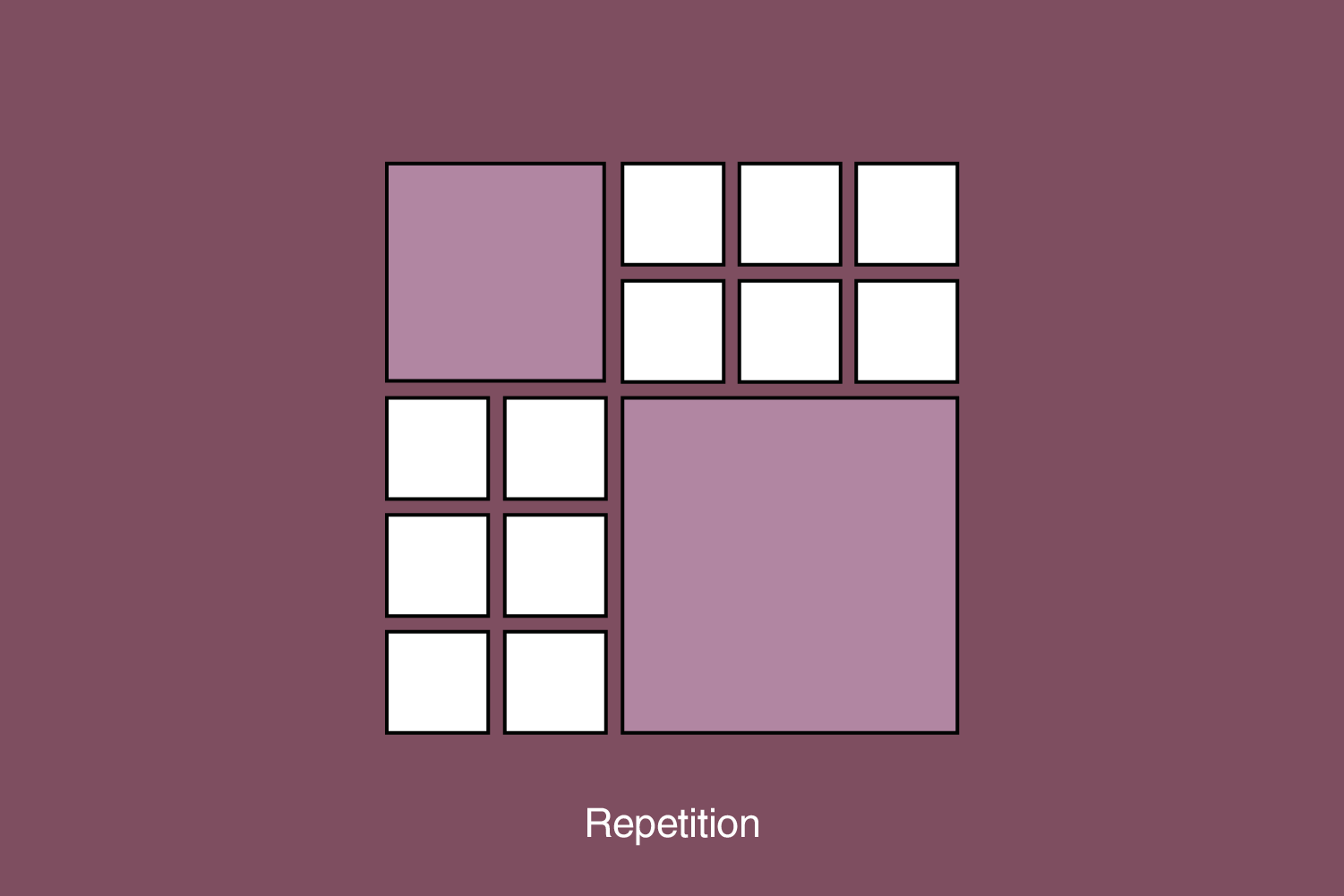
Repetition creates a pattern or a uniform feel to a design. It creates a recognizable and consistent look in the design. Repetition means creating visual consistency by repeating an element, such as colors, styles, or shapes.
This is a fundamental rule in digital design, especially in UI design. It is important that the user can “at first” recognize the importance and function of that element according to the shape, color, style, contrast, or any of the other principles combined with it. For example, the primary buttons in some UI will have the expected appearance and be in the desired place.
Creating strong repetition makes it easier for the brain to decode, understand and remember the communication. Using consistent visual elements throughout the design creates unity and reinforces the overall message. It also helps in establishing a visual rhythm and enhances the brand identity.
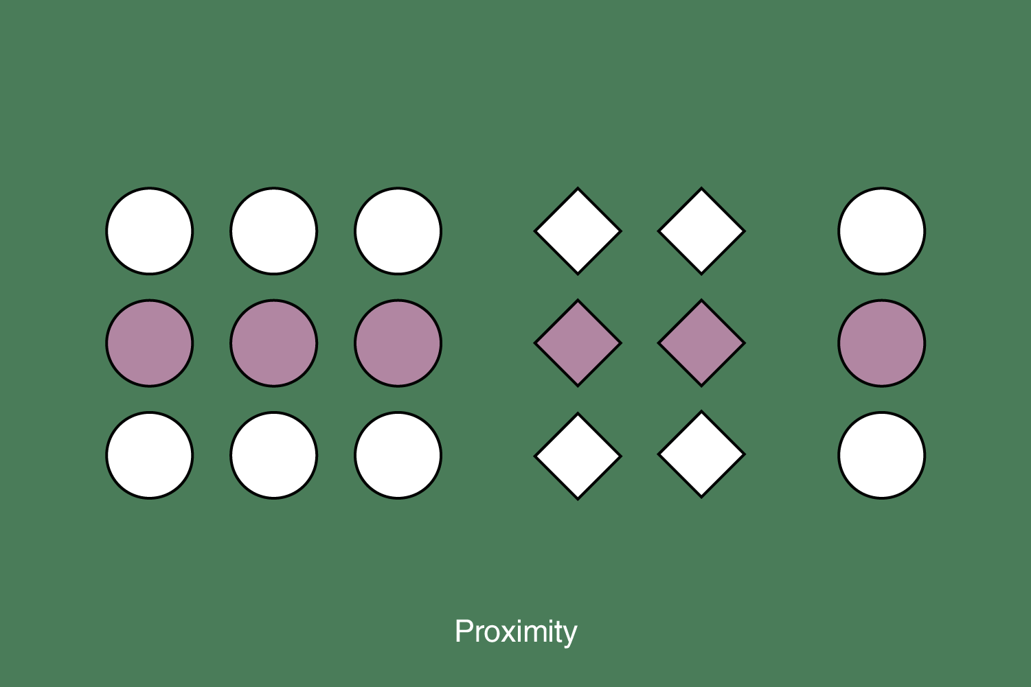
7. Proximity
Proximity is the relationship between design elements and how they relate. This is a fundamental design principle due to user perception and element scanning.
Proximity applies to spacing, typography, shapes, and the arrangement of information on a page. Proper use of proximity makes communication clear and easier to understand.
Design elements that require visual unity must be placed close together, while elements that require a separation or difference should have greater space between them. Elements close to each other are perceived as connected, while elements spaced apart are perceived as belonging to a separate group.
Also, users perceive elements close to each other as one group and expect that such elements share similar functionality – for example, in the UI. Using spaces to join or separate elements is most important for meaningful grouping.
The proximity of elements is essential and ubiquitous. It is used even for basic textual content. For example, sentences are grouped in paragraphs, separated above and below by a space. Spaces around properly designed headings signal which paragraphs they are connected to — text from the corresponding paragraph is usually closer to the previous paragraph’s text.
“For a designer to be able to do something invasive outside the rules, he must first know those rules very well and adapt existing practices. Only when designers have properly adopted all the rules and principles, they can create an innovative and “outside the box” solution”, Antonela Jedvaj, Design Team Lead at Async Labs
Let’s see what more Antonela has to say…
How do you ensure that your digital designs effectively incorporate the principles of balance, rhythm, and harmony?
The elements should be different from one another but related correctly. When the design guides the user’s eyes through a story, it keeps users visually entertained and engaged, enabling us to recognize the correct combination and utilization of balance, rhythm, and harmony.
How do you approach designing for accessibility and inclusivity in your digital projects?
In digital design, especially UI and UX design, I always rely on design principles that ensure improved accessibility for people with some disabilities. For example, while I design for visual disabilities, I rely on principles like contrast, scale, and repetition. I ensure that colors, font weights, and sizes have the proper contrast ratio.
I provide designs that can scale when users increase page element sizes. Predictable layouts and section headings to create structure can also help people with visual disability but cognitive or physical disability. I always have emphasis and balance principles, especially when designing for people with mental and physical disability. Creating a strong hierarchy and highlighting the page’s focus is essential so users can easily navigate.
Also, there is proximity. Utilizing space on the page to break up sections and focus on content can help people with attention problems or have a physical disability like Parkinson’s disease. And too much content in a small space can overstimulate and confuse users with a cognitive disability.
Elements of Graphic Design
Graphic design elements are the fundamental building blocks designers use to create visual compositions. These elements include:
- Line: The basic element of design, lines can be straight, curved, diagonal, or organic. They create a sense of direction, movement, and structure within the design.
- Shape: Geometric or organic forms that define objects or areas within the design. Shapes can be simple (circles, squares) or complex (abstract forms).
- Color: The use of hues, tints, and shades to convey emotions, set the mood, and create visual impact. Color is a powerful tool for attracting attention and establishing brand identity.
- Texture: The tactile quality or visual appearance of surfaces within the design. Texture adds depth and visual interest to the composition.
- Typography: The art of arranging and using fonts visually appealingly. Typography plays a crucial role in communicating information and evoking emotions.
- Space: The area or distance between elements in the design. Effective use of space can create balance, lead the viewer’s eye, and emphasize certain elements.
- Value: The lightness or darkness of an element in the design. Value helps create contrast, depth, and three-dimensional effects.
According to graphic design principles, graphic designers can craft visually engaging and meaningful compositions that effectively communicate their intended messages.
How to adapt principles in digital design to different platforms and devices
Adapting design principles to different digital platforms and devices ensures your user experience remains consistent, efficient, and enjoyable across mobile phones, tablets, web browsers, and apps. Here are some essential steps to achieve successful design adaptation:
1. Understand the platform and its context
Each platform (mobile, web, app) has unique characteristics, limitations, and user behavior. Before adapting your design, thoroughly research and understand the platform’s capabilities, screen sizes, input methods, and the context in which users interact.
2. Responsive design
Implement techniques seamlessly adapting to different screen sizes and orientations. This approach will automatically adjust your content and layout, providing an optimal user experience regardless of the device.
3. Consistent branding and UI elements
Maintain consistent branding and UI elements across all platforms to create a unified user experience. Consistency builds familiarity and helps users navigate your digital ecosystem more easily.
4. Prioritize content and features
Different platforms have varying space constraints and user needs. Prioritize essential content and features based on the platform’s context. For example, a mobile app might emphasize simplicity and quick access to critical functions, while a web application can afford more comprehensive features and content.
5. Optimize user flow
Understand how users navigate and interact with each platform. Adapt the user flow to match user expectations and ensure a smooth, intuitive experience.
6. Touch and gesture considerations
Touch and gestures are crucial on mobile devices. Design for touch-friendly interactions and consider mobile-specific motions like swiping, pinching, and tapping when adapting your design.
7. Performance optimization
Different devices have varying processing power and internet connectivity. Optimize your design to ensure fast loading times and smooth interactions across devices.
8. Test on real devices
Don’t rely solely on emulators or simulators. Test your design on real devices to observe how it behaves and performs in real-world scenarios.
9. Accessibility
Ensure your design is accessible on all platforms by adhering to accessibility guidelines. This includes considerations for screen readers, color contrasts, font sizes, and other accessibility features.
10. Iterative design process
Design adaptation is an ongoing process. Continuously collect user feedback, conduct usability testing, and make iterative improvements to enhance the user experience across all platforms.
11. Platform-specific guidelines
Each platform may have its own design guidelines and best practices. Familiarize yourself with platform-specific guidelines (e.g., Apple’s Human Interface Guidelines for iOS) to ensure your design meets user expectations.
Following these steps, you can effectively adapt design principles to different digital platforms and devices, resulting in a consistent, user-friendly experience for your audience.
Make your design standout
Designing an effective composition is about a balance between technological skills and creativity. And principled design makes all the difference. Applying principles and elements of graphic design can help designers create appealing and effective designs analytically and deliberately.
These principles are more than making a pretty design — creating communication that helps people absorb and process your message effectively. Remember, good design is about following the rules and knowing when and how to break them.
Whether you’re an experienced designer or a client looking for design services, these principles and elements provide a solid foundation to build your design work, creating effective communication.
Ready to create a standout design? Reach out to us and make an impact with your visuals.